A timeless and enduring blue hue, PANTONE 19-4052 Classic Blue is elegant in its simplicity. Suggestive of the sky at dusk, the reassuring qualities of the thought-provoking PANTONE 19-4052 Classic Blue highlight our desire for a dependable and stable foundation on which to build as we cross the threshold into a new era.
Imprinted in our psyches as a restful color, PANTONE 19-4052 Classic Blue brings a sense of peace and tranquility to the human spirit, offering refuge. Aiding concentration and bringing laser like clarity, PANTONE 19-4052 Classic Blue re-centers our thoughts. A reflective blue tone, Classic Blue fosters resilience.
We are living in a time that requires trust and faith. It is this kind of constancy and confidence that is expressed by PANTONE 19-4052 Classic Blue, a solid and dependable blue hue we can always rely on. Imbued with a deep resonance, Classic Blue provides an anchoring foundation. A boundless blue evocative of the vast and infinite evening sky, Classic Blue encourages us to look beyond the obvious to expand our thinking; challenging us to think more deeply, increase our perspective and open the flow of communication.
- Leatrice EisemanEXECUTIVE DIRECTOR OF THE PANTONE COLOR INSTITUTE
As technology continues to race ahead of the human ability to process it all, it is easy to understand why we gravitate to colors that are honest and offer the promise of protection. Non-aggressive and easily relatable, the trusted PANTONE 19-4052 Classic Blue lends itself to relaxed interaction. Associated with the return of another day, this universal favorite is comfortably embraced.
About Pantone Color of the Year
For 20 years, Pantone’s Color of the Year has influenced product development and purchasing decisions in multiple industries, including fashion, home furnishings, and industrial design, as well as product, packaging and graphic design.
The Color of the Year selection process requires thoughtful consideration and trend analysis. To arrive at the selection each year, Pantone’s color experts at the Pantone Color Institute comb the world looking for new color influences. This can include the entertainment industry and films in production, traveling art collections and new artists, fashion, all areas of design, popular travel destinations, as well as new lifestyles, playstyles, and socio-economic conditions. Influences may also stem from new technologies, materials, textures, and effects that impact color, relevant social media platforms and even up-coming sporting events that capture worldwide attention.
About the Pantone Color Institute™
The Pantone Color Institute is the business unit within Pantone that highlights the top seasonal runway colors, selects the Pantone Color of the Year, forecasts global color trends, and advises companies on color for product and brand visual identity. Through seasonal trend forecasts, color psychology, and color consulting, the Pantone Color Institute partners with global brands to effectively leverage the power, psychology, and emotion of color in their design strategy.
Color Formula & Guides
PANTONE Color of the Year 2020 can be found in the following color systems:
- FASHION, HOME + INTERIORS (COTTON)
PANTONE 19-4052 CLASSIC BLUE TCX - PLUS SERIES (INK)
PANTONE 2154 C - FASHION, HOME + INTERIORS (PLASTIC)
PQ-19-4052 TCX Get Classic Blue in ASE file format for
Adobe® Applications.
*CMYK values are approximate and were established under specific criteria. To be used as a starting point only. When reproducing these colors in CMYK, please have the printer adjust them visually on the specific substrate and within your printing parameters so that the best possible simulation to the color is achieved.
+Please note: The color may appear different under various light sources due to metamerism. This metamerism is to be expected between multiple substrates due to varying methods of product manufacturing.
Tools for Designers
More than 10 million designers and producers around the world rely on Pantone products and services to help define, communicate and control color from inspiration to realization – leveraging advanced X-Rite technology to achieve color consistency across various materials and finishes for graphics, fashion and product design. Pantone Standards feature digital and physical color specification and workflow tools.
Read on to learn more about applying the Color of the Year 2020 across various industries, determine color values across our color systems, explore palettes and color harmonies and more.
How to use PANTONE Color of the Year 2020
We have created five unique color palettes featuring PANTONE 19-4052 Classic Blue to help you bring this year's special shade into your designs. Each color palette conveys a different mood illustrating the versatility of Classic Blue and is supported by three suggested color combinations.
Get the Classic Blue Palettes
Pantone Connect, a time-saving color extension for Adobe® Creative Cloud®, includes five different pre-loaded color palettes featuring Classic Blue. These Color of the Year themed palettes, along with every other Pantone Color, are available to browse through and integrate directly into design files within Adobe Photoshop®, Illustrator®, and InDesign®. Pantone Connect also offers designers an easy way to convert to Pantone from non-Pantone colors and collaborate on palettes with teammates.
DOWNLOAD FROM THE ADOBE EXCHANGE MARKETPLACE
PONDER
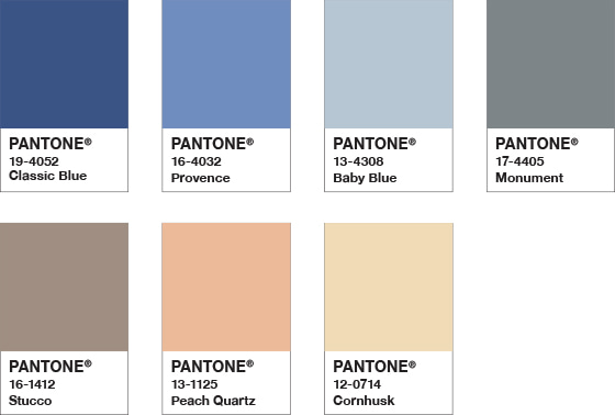
Color Harmonies

Surrounded by a palette of cool blues and an array of warm and soothing shades, thoughtful and meditative PANTONE 19-4052 Classic Blue helps induce a gently calming effect and feelings of peaceful tranquility to the human spirit.
SNORKEL
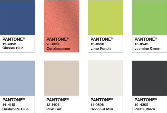
Color Harmonies

Evocative of a bliss filled tropical paradise, the enchanting color story in Snorkel transports us to an idyllic destination. The addition of a classic black and white creates a dramatic contrast with the depth and strength of PANTONE 19-4052 Classic Blue, providing the anchoring foundation.
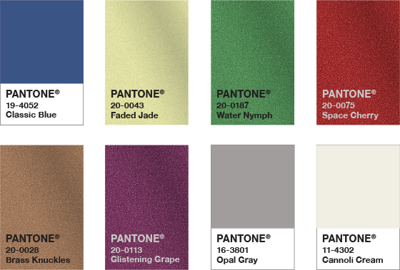
DESERT TWILIGHT
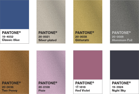
Color Harmonies

Suggestive of the early evening sky, the boundless PANTONE Classic Blue 19-4052 creates an elegant backdrop for a glittery grouping of sophisticated shades painted across the sky adding illuminating sparkle to a Desert Twilight.
EXOTIC TASTES
Color Harmonies

An intriguing and adventurous potpourri of tastes and colors reflective of natural seasonings, condiments and blue foods. Blue foods such as PANTONE 19-4052 Classic Blue are rich in anthocyanins, and with their relationship to wellness and self-care, help to build a solid foundation, acting as a form of protection for good health.
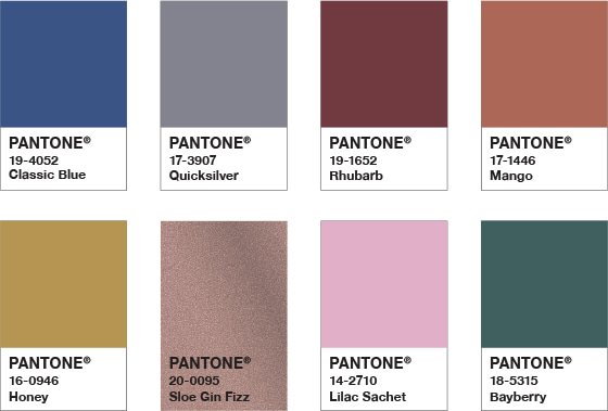
UNTRADITIONAL
Color Harmonies

Nothing says untraditional better than an unusual and unexpected palette of colors. Standing at the helm is PANTONE 19-4052 Classic Blue, a foundational shade that sets the stage for unique combinations, fun color mixes as well as some other more outrageous and surprisingly shimmery fashion statements.
이전/다음 글 이동